Sound Map
For this class project (in the Master in Sound Art I took), we got the assignment of designing a sound map with personal takes and the direction each of us would like to take.
After many drafts and ideas, I decided to go for a more design-typeface line where the shape and details of a letter would be the representation of the quality of the sound.
Even if the work could have been more abstract or conceptual, I sticked to what a map would be from a general-upper view; we have on the upper-left corner montañas, what translates to mountains; followed by tren (train) in the right side, ciudad (city) in the center, which is divided by a park, parque. In the bottom-right corner is playa (beach) and mar (sea).
For this work, the process consisted of the drawing of a first draft-map, followed by the creation of the typefaces over it with Procreate; first as a map draft1 which gave the layout of the final map and then the typefaces were drawn on top2.
Then, the typefaces were vectorized with Illustrator3 before moving them to Blender4, where I played with shapes, and I also sculpted them with different techniques in order to have the texture they needed to represent.
The final work and layout was made with Photoshop5; with the use of AI where i added more representative elements of each “area”, such as moss, birds, people, flowers, steam, fishes, lights... and many other elements that make a location vibrant and different.
From a quick view of the map, you can see that the textures of the letters go with what the represent; mountains are rocky and tough, with drastic changes and cuts, and growth of vegetation.
The train has a more rusty-metallic sense, with sharper shapes that are bended, a slightly wood effect added to it and blur to represent its moving personality.
In the city you would hear a wide variety of sounds and with help of AI I could add many things that would represent it such as steam, sewages, people, a church, industrial-metallic elements, cars... The typeface itself has sharp and geometrical shapes with a concrete texture that gives the street feeling. Also a train connects upper and lower part, which is separated by the park.
The park has a more soft-roundy shape; so it could give the sensation of softness and comfot. In a green color to link with nature, a grass texture was added and some elements with generative image such as flowers, leaves, snails, twigs... So many micro-elements with micro-sounds.
Next, the beach has a inflated shape with sand and a more seen light effect than the other elements. Typical elements such as a starfish, little shells, a stub... Also, while some letters are more readable, I wanted to represent a sand-beach effect that you experience when being in the beach; big shapes in order for them to stick together, wet-ugly sand balls.
For the final part; the sea typeface has a deep-ocean-blue color and round texture, while the shapes are more flowy and have more movement than the other ones of the map. The added elements to give it a marine representation were bubbles, fishes, splashes... plus gaps that different letters have which gives it a more liquid style.
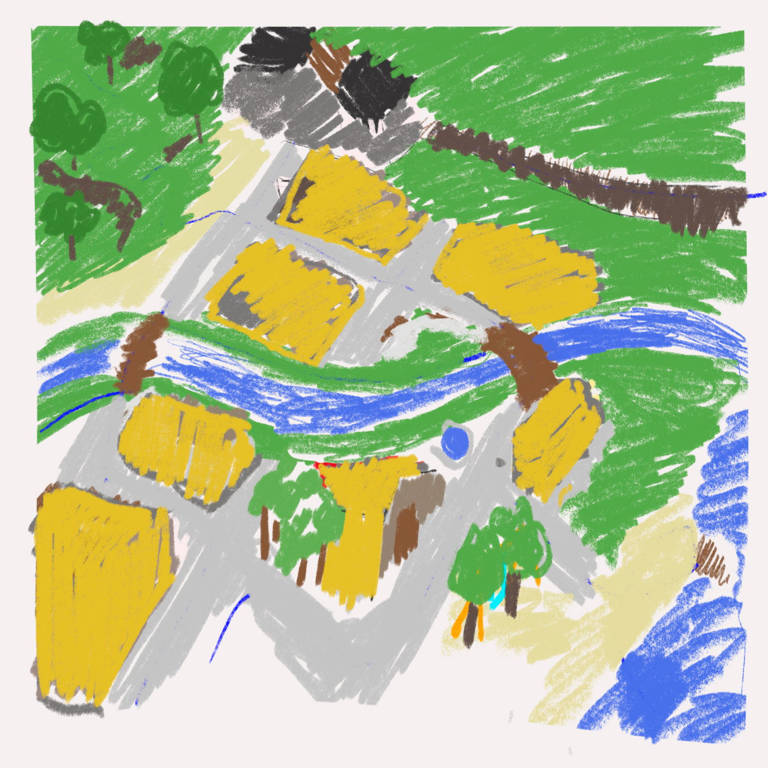
1 First digital map draft in Procreate
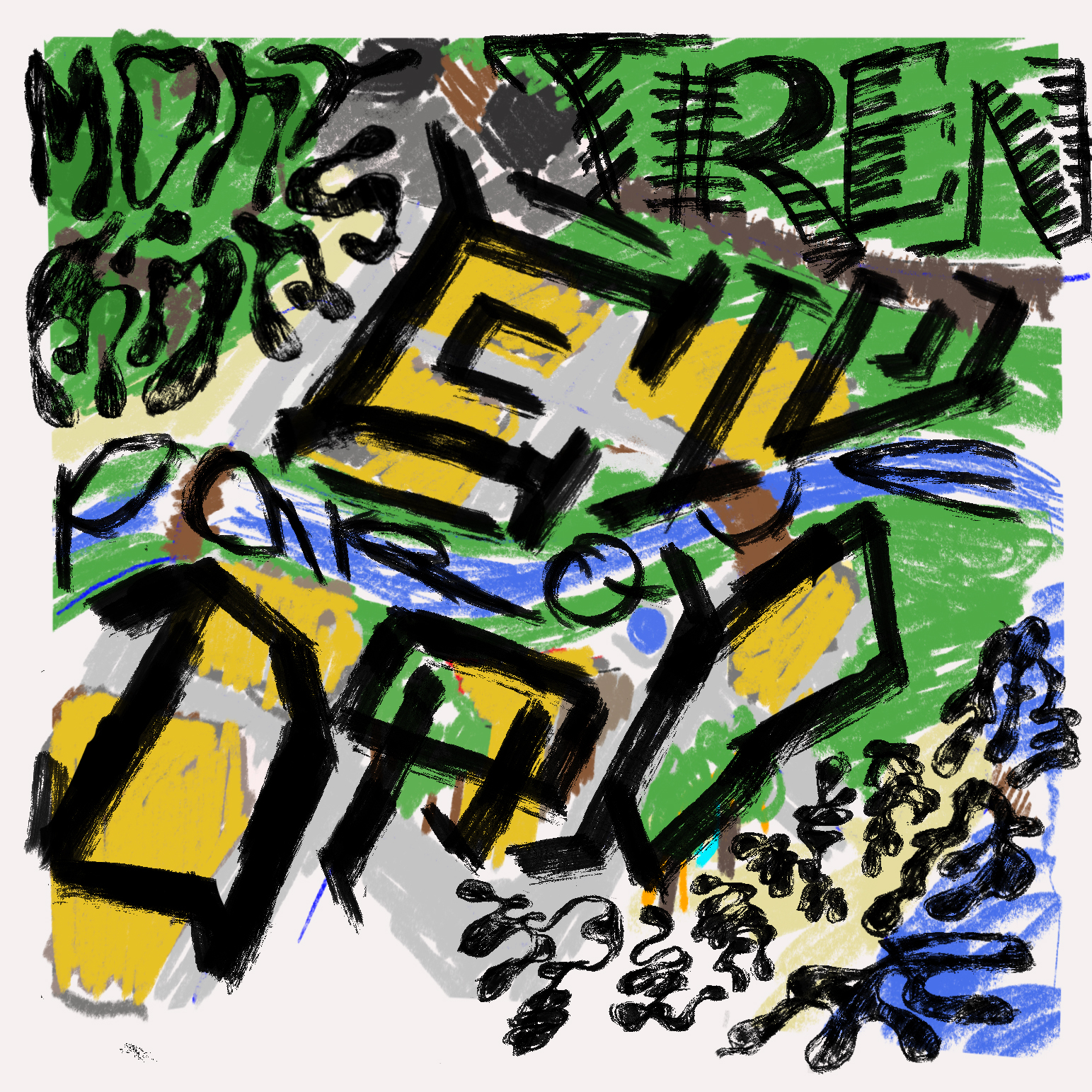
2 Typefaces drawn over map in Procreate
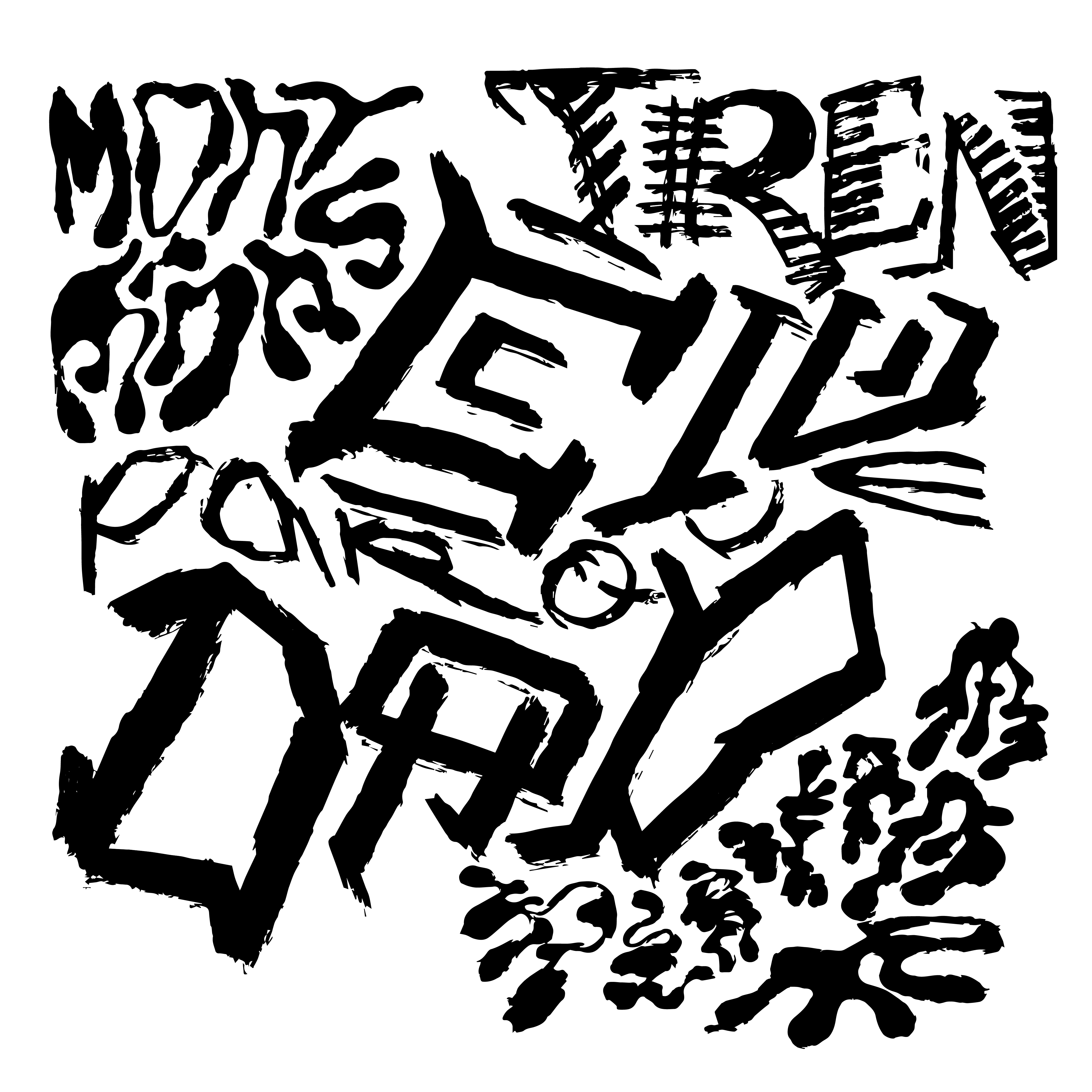
3 Vectorized typeface in Illustrator
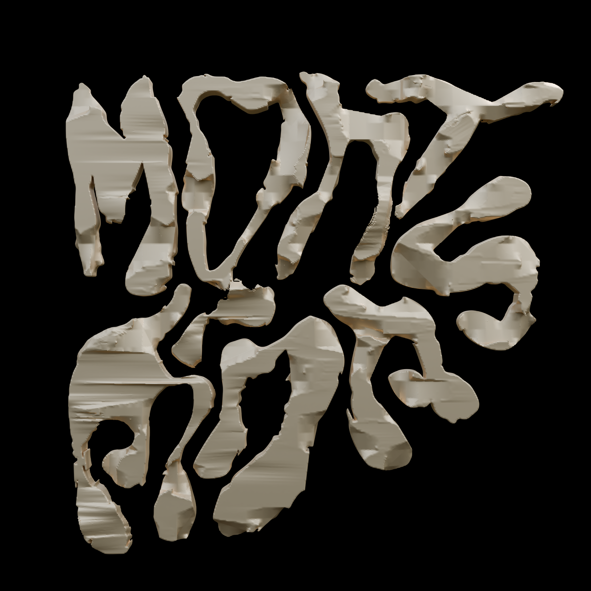
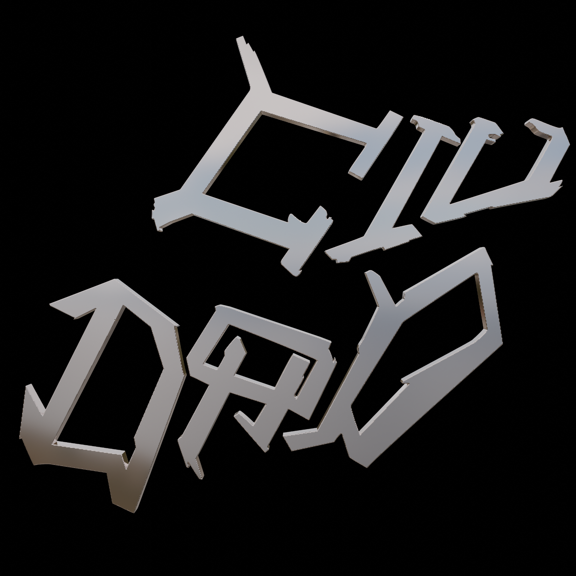
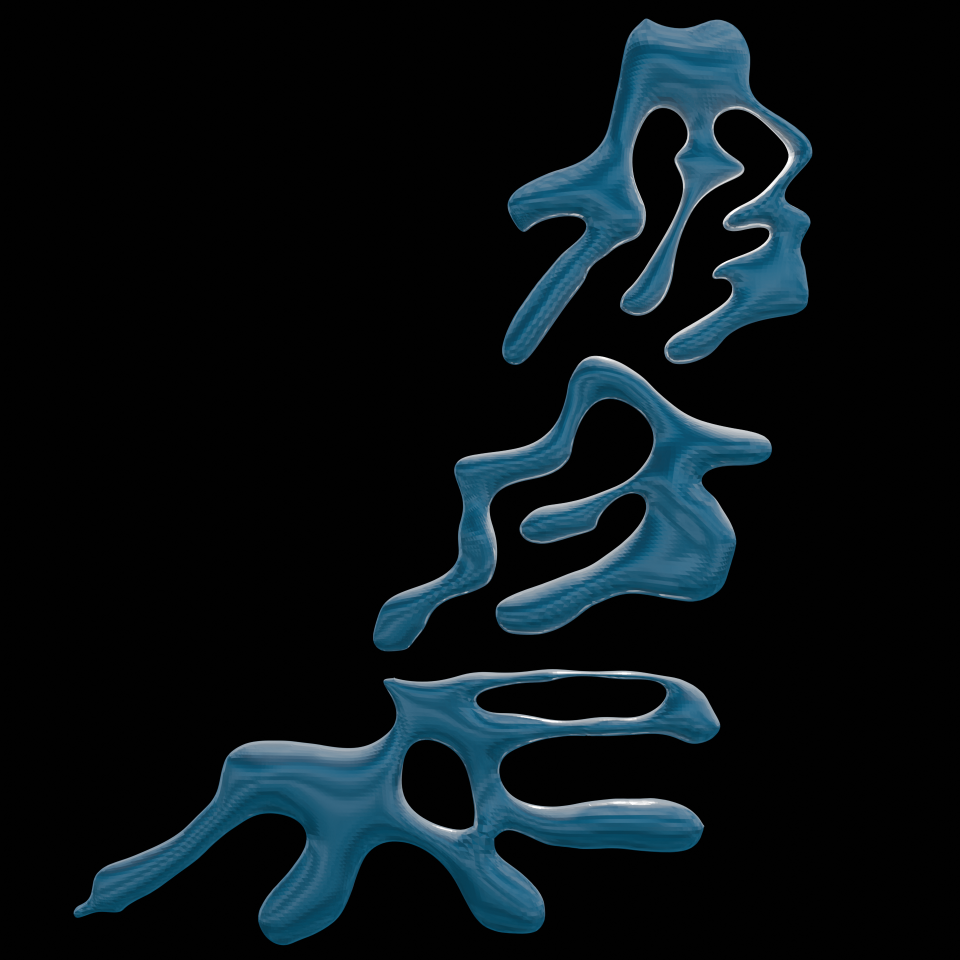
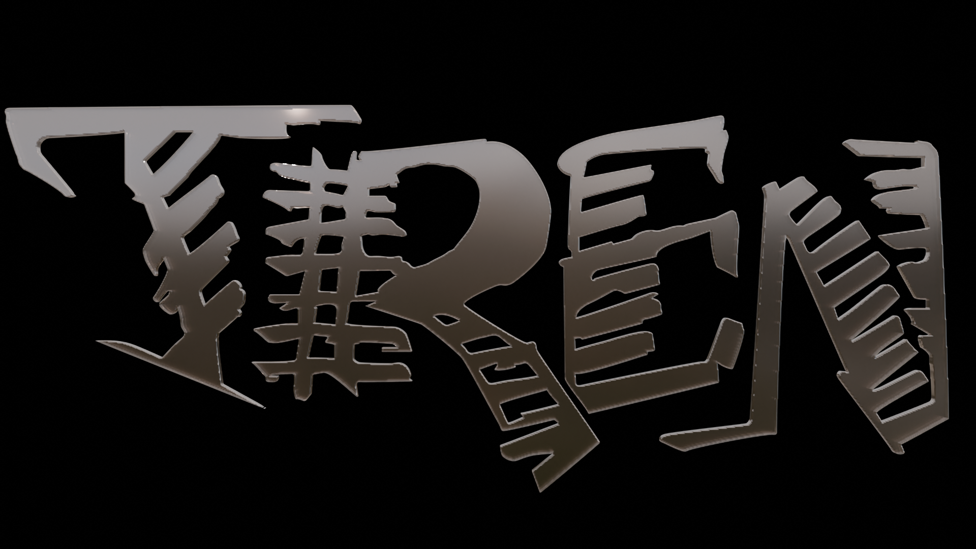
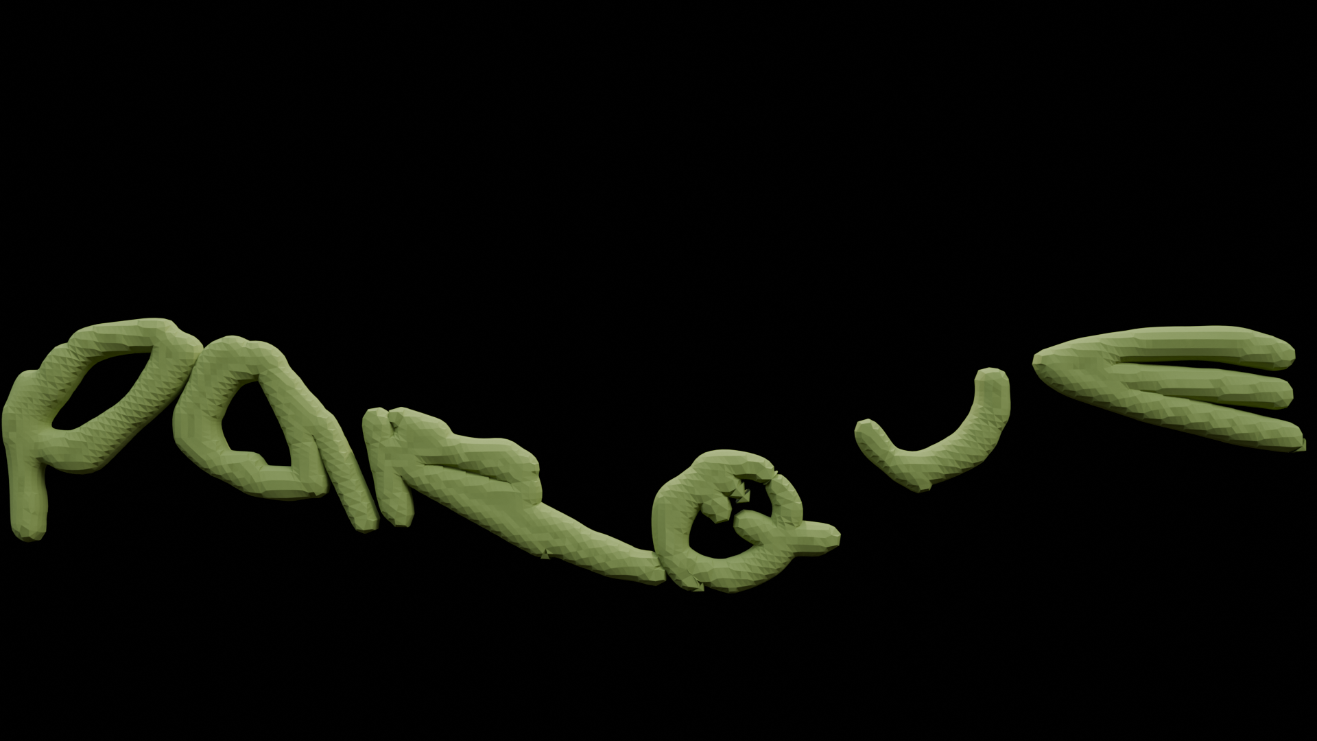

4 Singular 3D work done with Blender
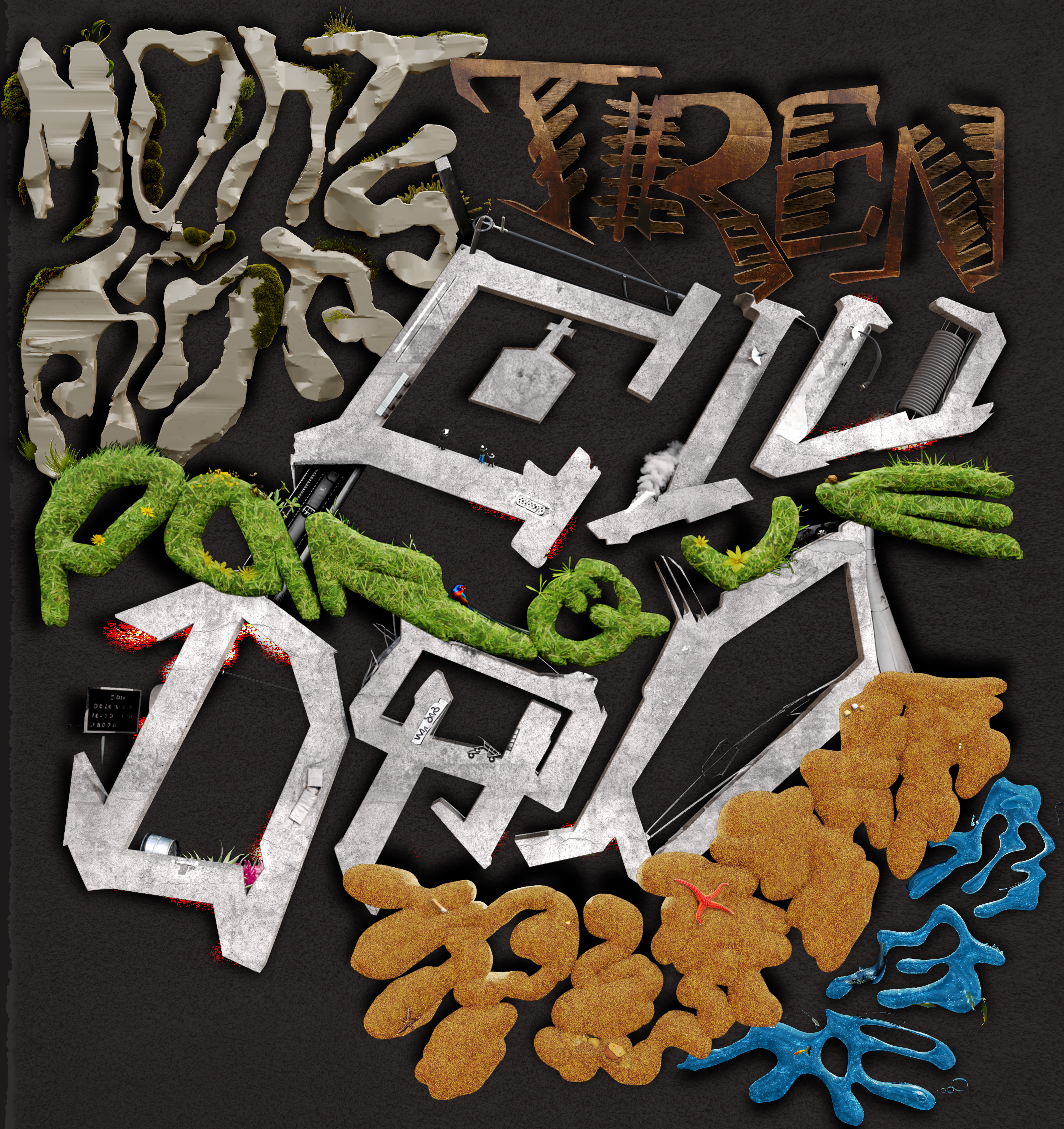
5 Final wok with last Photoshop AI addings.