b2com rebranding (formerly Premium Numbers)
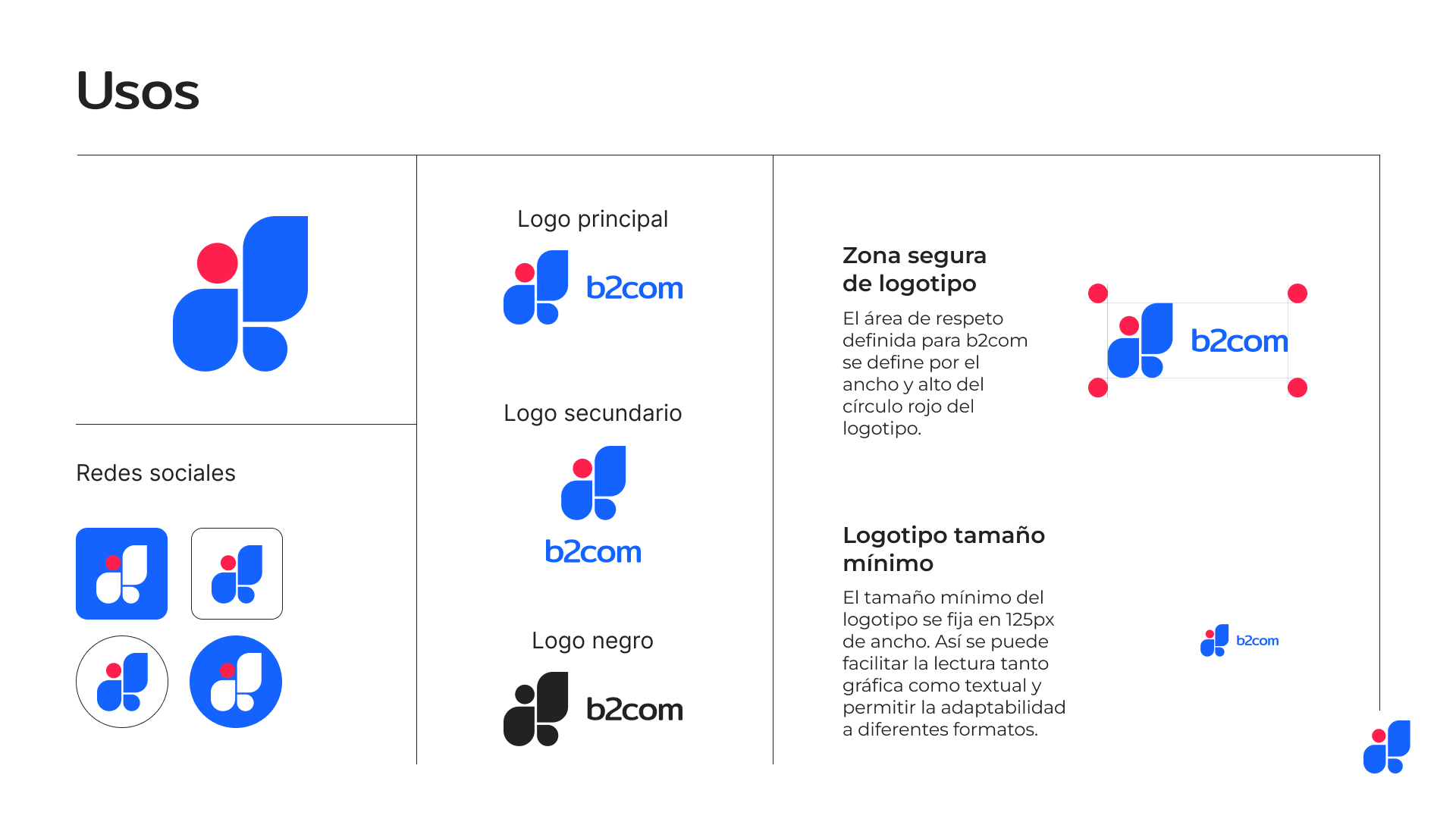
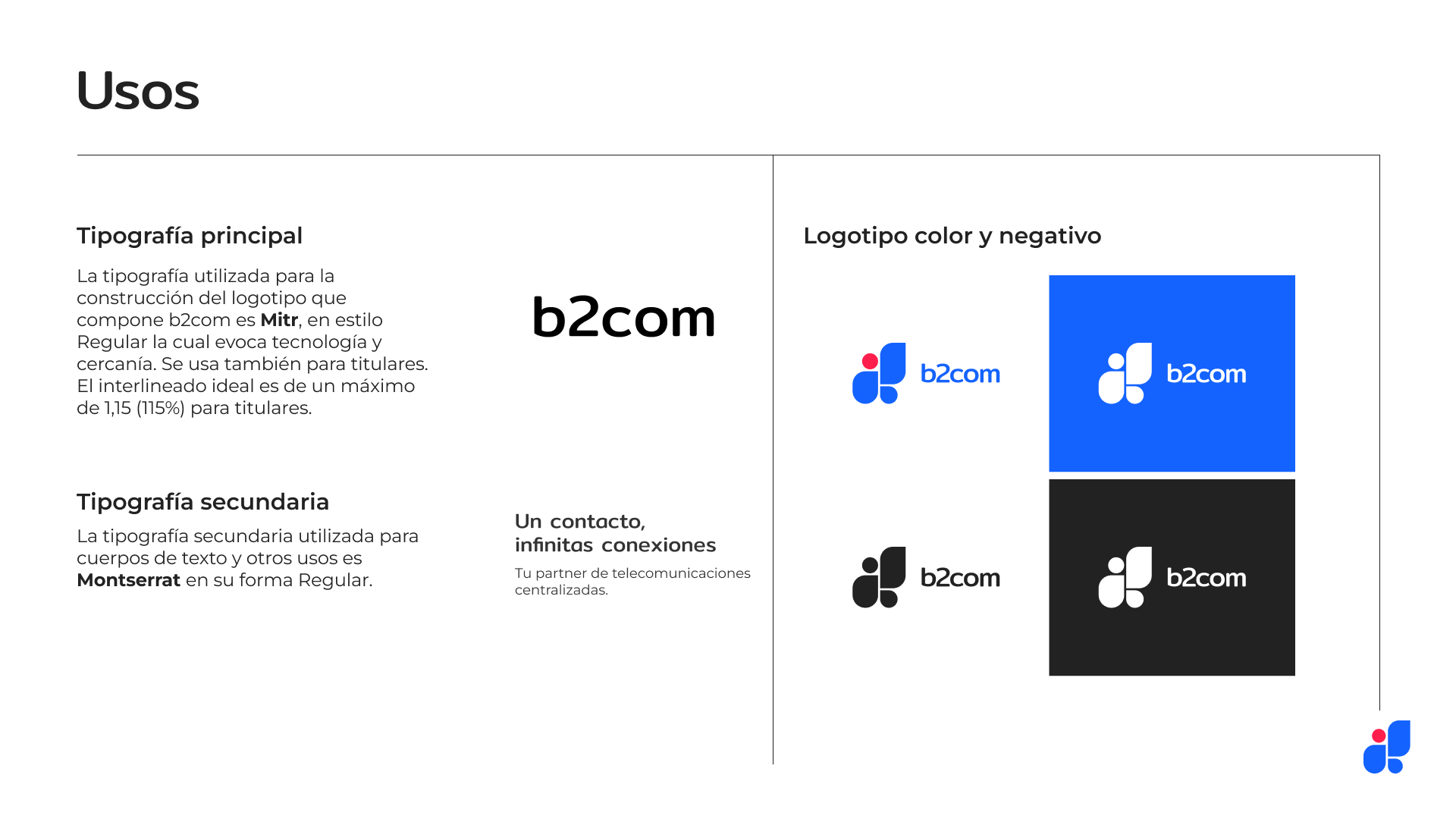
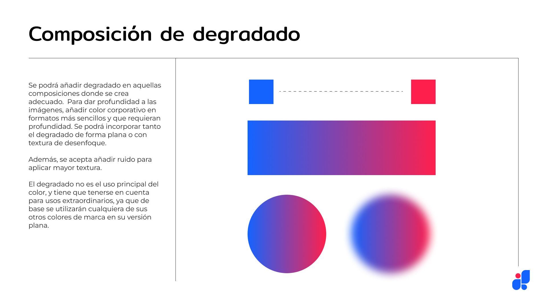
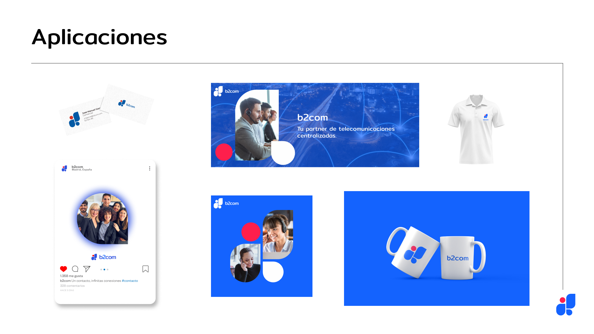
For this project, done while I was working in an agency based in Valencia, I had to do the rebranding of a communications company. They also requested a brand identity manual that you can see below (in Spanish).

Their formerly brand, Premium Numbers, was originally with dark colors, straight lines that were unfiendly, with contrast and an ambiguous feeling of what it was. I could also sense a slight representation of the initials, P-N in the logo. There was a link with connection and their representation, but it had a lack of feeling up to date.
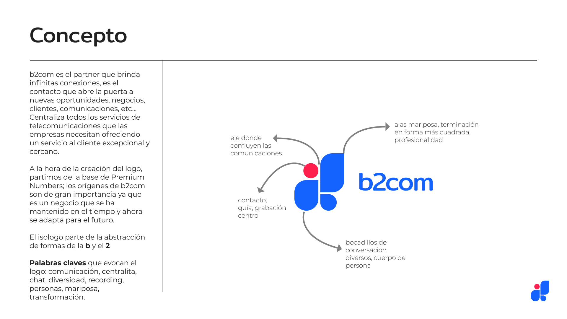
For the rebranding idea, I wanted to embrace the original logo and come from there. As the name was also changing, I had a whole white canvas to do whateve I felt like.
After some research, and the change that the company was going through, I decided to implement straight and round shapes so it could loke as a conversation, with a more linked font with the logo and a vibrant-digital color.
Find below the process of how I arrived to this effective and outstanding brand identity design.


origin










final

