Typefaces
During the years, I have been created different typefaces either animated or still. Here I could apply knowledge in typography, 3D, layout and others like vector work with Illustrator. Many of the creations were for the single use of the typeface itself, applying textures and the identity of the letters with what they wanted to represent but also experimenting with them.
Sometimes this worked as therapy-relaxation and to try different techniques. The usage of them has been mostly digital and social media.
Some other typefaces created won’t be shown here, as are part of other commissions (so they have other pages) or fanzines.
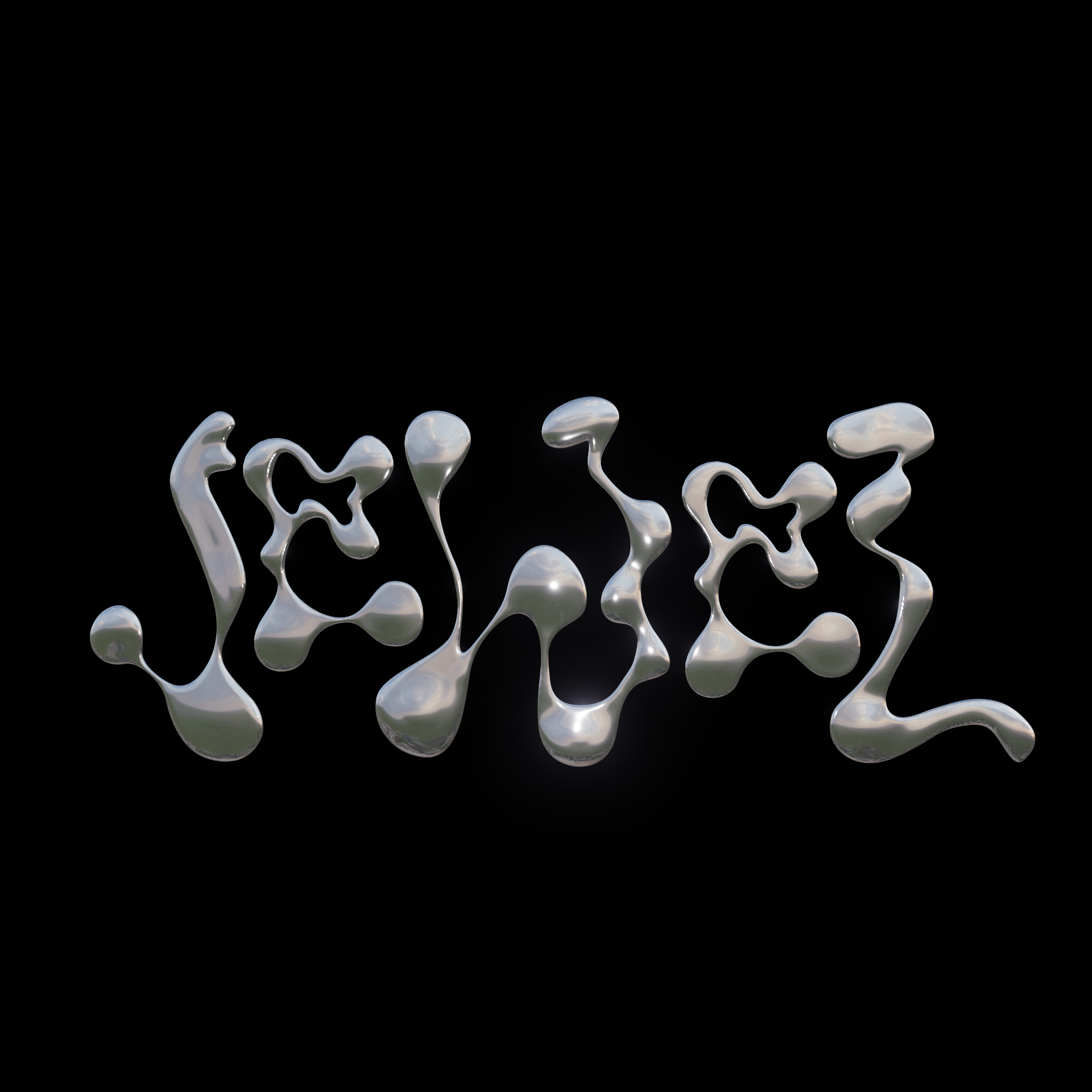
Jewel
For this animated typeface, I created a kind-of jewelry composition with a metallic touch and shine. This was originally inspired by Australian DJ and producer Flume’s song, Jewel. Also in a way of representing the song itself.
Don’t mind me
I am evolving
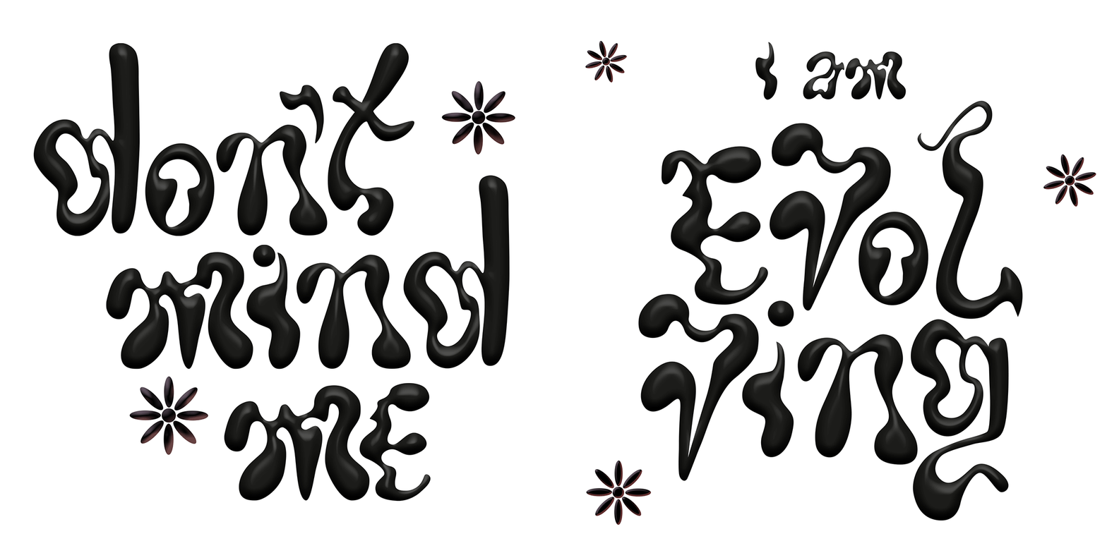
For this typeface, which consisted of two parts. First one being “don’t mind me” and the second one “I am evolving”.
I wanted to apply a more organic take for these letters, being able to work together but keeping a flowy and dynamic aesthetic that could link with what I wanted to represent.
Life, overall, is a jouney where evolution happens naturally.
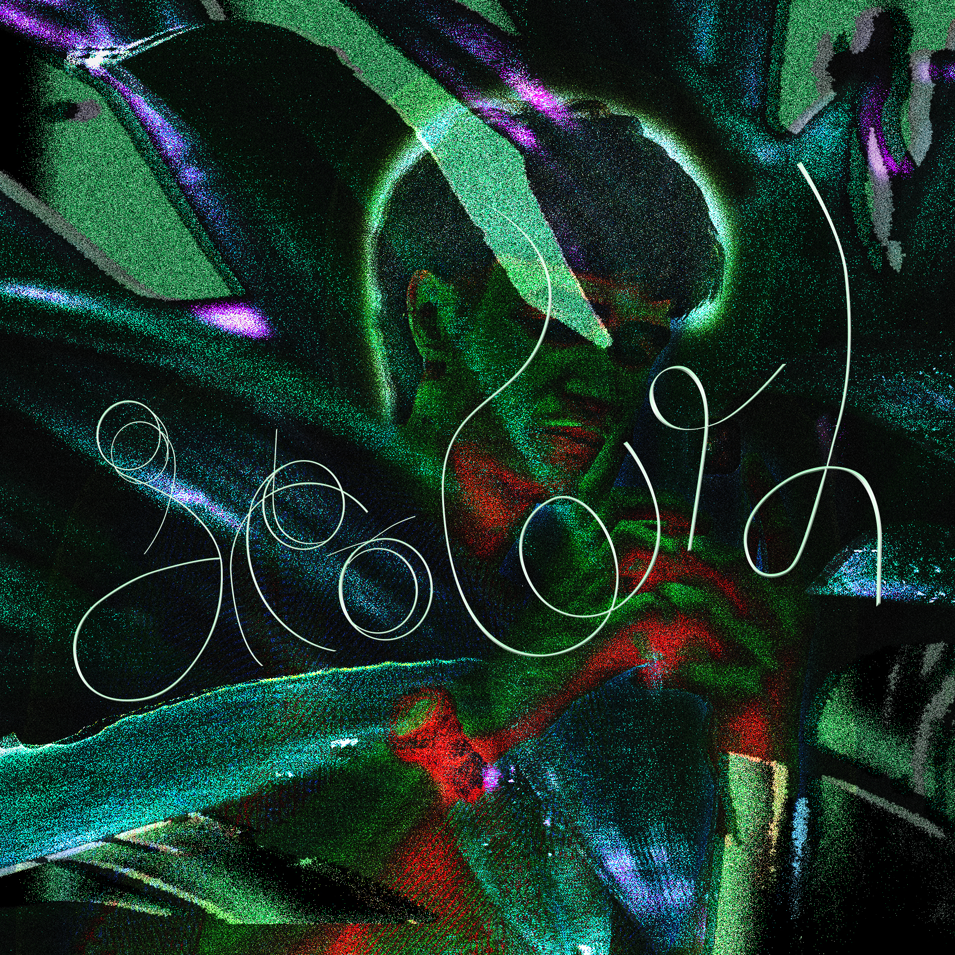
Growth
This typeface was created originally with hairs on a wet wall that I could move around and experience with it to create the growth word.
I made a layout with different photos I took of nature elements and a picture of me. At the end this are really personal works which also help me to understand myself and experience with design and visuals.
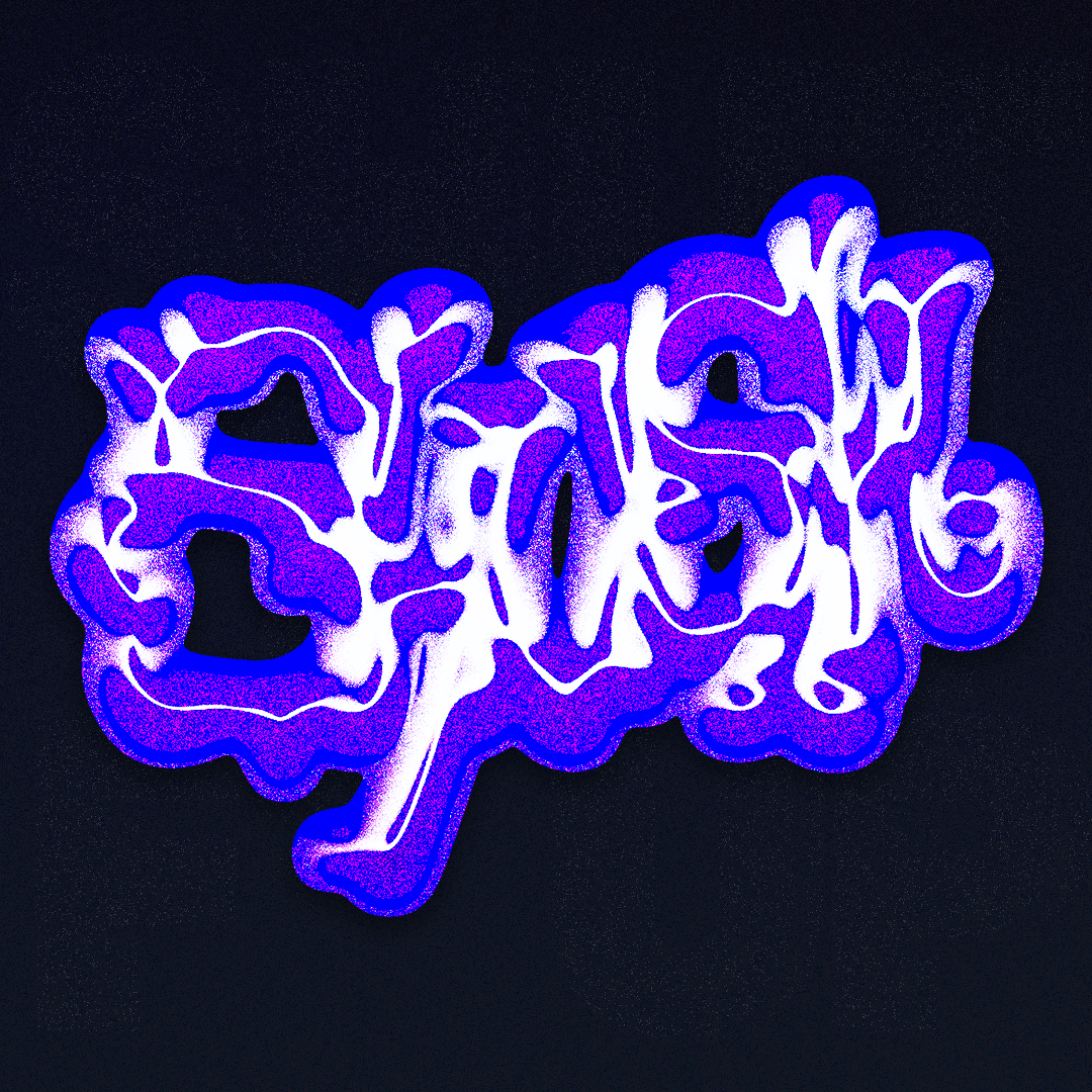
September
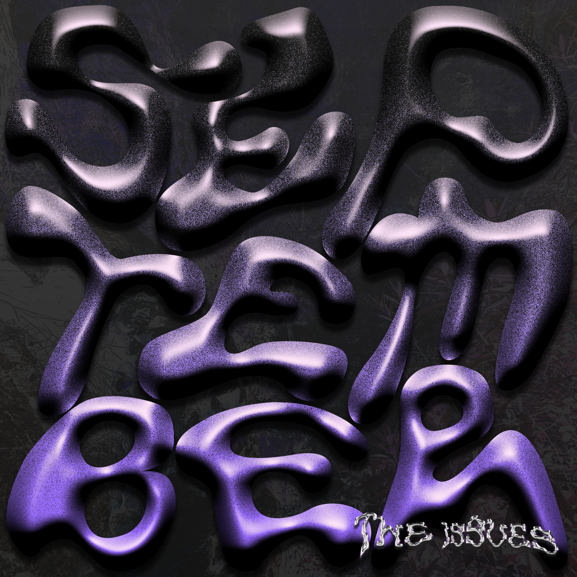
For this typeface, which started to make me create monthly typefaces, I made a bubbly layout with mostly Photoshop, after the vectorization with Illustrator.
On the righ-bottom part, The Issues, made in another style which would then collect different monthly works and texts.
Tenerife
This 3D typeface was inspired by a trip to Tenerife. I applied to the letters natural motifs that would be around the island, with rocky structures, round shapes and an organic layout. This was created with Blender, Illustrator and Photoshop. This consisted of a fanzine with photos of the trip and the people I went with.
I shared via Instagram with the future idea of printing and collecting all fanzines together as a new kind of photobook.


Mood ring
This typeface was inspired by Lorde’s song: Mood ring. A flowy typeface that I did with Illustrator and also later a different version with Photoshop.
The overall layout creates a circle, leading to the ring word.
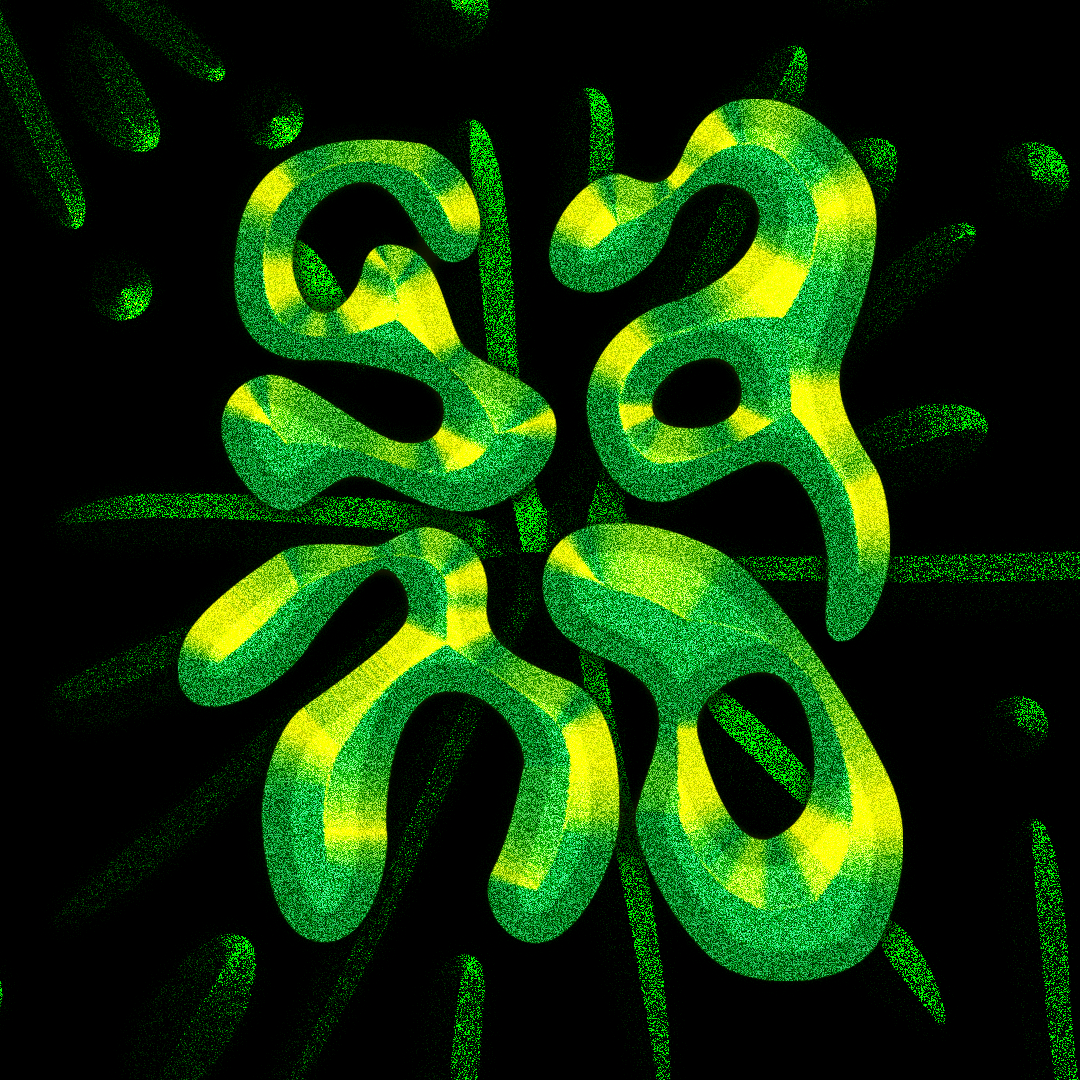
Sano
For this typeface, I used Illustrator and Photoshop. The image shows the word sano in spanish which means healthy, but in an intense and toxic green to emphasize the dichotomy of wanting to be healthy while creating that habit a toxic routine where you can be trapped.
